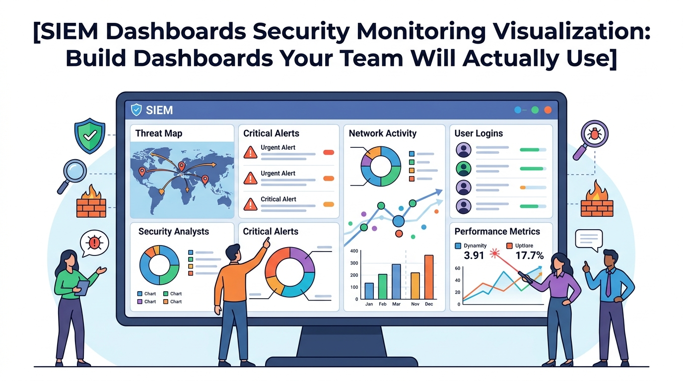
Effective SIEM dashboards security monitoring visualization is about more than displaying charts and graphs. The goal is to help teams quickly understand what’s happening, identify threats, and make informed decisions.
At Network Threat Detection, we’ve seen organizations collect massive amounts of security data only to struggle with turning it into meaningful insights. A well-designed SIEM dashboard bridges that gap by presenting the right information to the right audience, helping analysts, managers, and executives focus on what matters most. Keep reading.
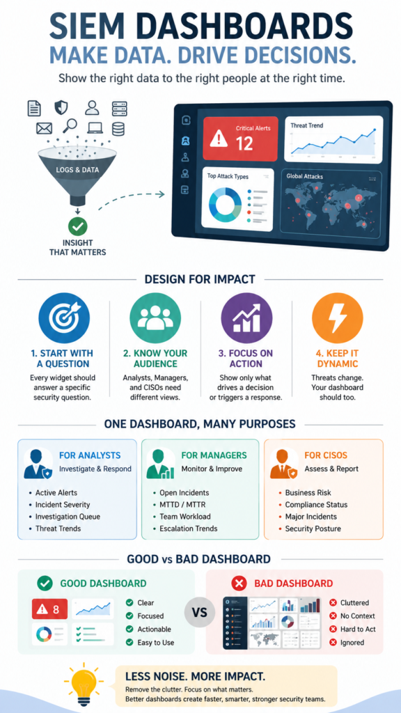
Dashboard Success Essentials
Before adding charts or metrics, focus on what decisions users need to make and how the dashboard can support those actions.
- A security dashboard should answer a specific question, not just display data.
- Different roles (analyst, manager, CISO) need completely different visual perspectives.
- The best dashboards are dynamic, focused, and trigger a clear action.
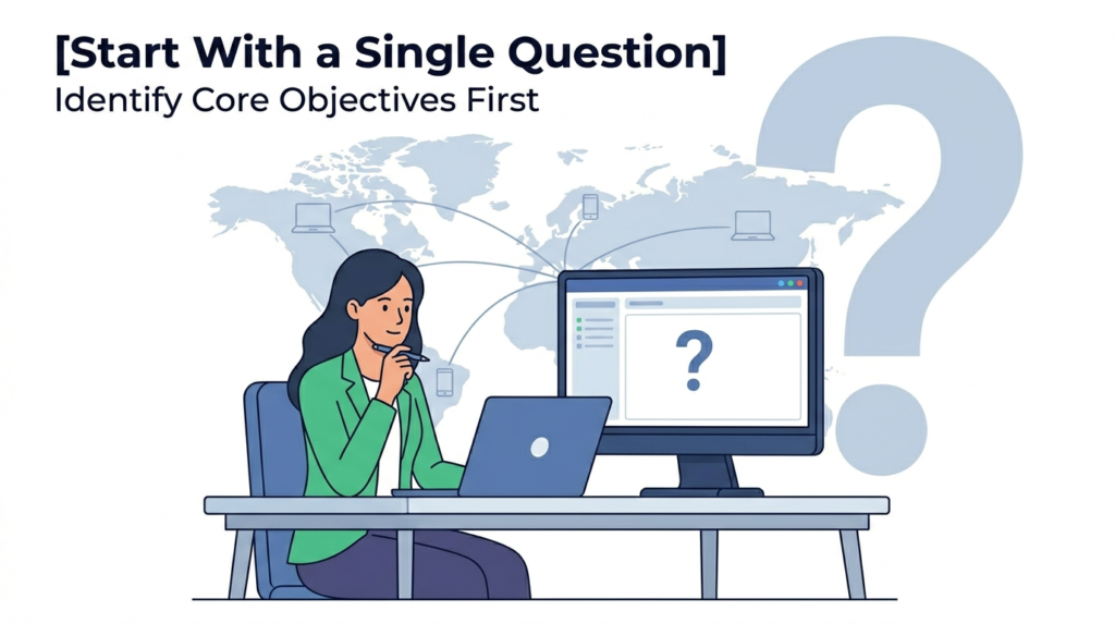
Start With a Single Question
Walk into a Security Operations Center and you’ll see walls of screens. Glowing graphs, scrolling logs, maps with blinking dots. It looks like mission control. But ask the analyst staring at it, “What’s happening?” Too often, the answer is a shrug. The data is there, but the meaning is lost. The dashboard has become a painting, not a tool.
“There’s a balance to be struck between data that seems important and data that is actionable. High-level dashboards tend to focus most on data that seems important but isn’t always actionable. Conversely, detailed analyst dashboard should consist almost exclusively of information that is actionable and has a clear plan of attack coming from it.” – Tevora
It’s displaying, not informing. We’ve all been there, building something we thought was comprehensive, only to watch the team ignore it. The turning point comes when you stop asking “what can we show?” and start asking “what do we need to know?”
What Makes a SIEM Dashboard Useless?
Credits: InfoSec Pandey
It usually starts with good intentions. You plug in the monitor and enable every widget without a strategy for ongoing siem rule tuning alert management practices. You get a pie chart of log sources, a line graph of events per hour, a top-ten list of alerting rules.
The pie chart never changes. The event graph spikes during business hours, which you already knew. The top-ten list is always the same noisy rules. This is dashboard as decoration. It consumes screen real estate but offers zero insight.
The worst offenders are vanity metrics. A giant number in the center: “Total Events Last 24H: 14,567,892.” What does that tell you? Is 14 million good or bad? It’s just a number, devoid of context. It doesn’t help you decide to pick up the phone or go for coffee. Another common failure is the “one dashboard to rule them all” approach.
Trying to serve the needs of a Level 1 analyst and the CISO on the same screen is impossible. The analyst needs raw data to investigate, while the executive needs a broader view. Relying purely on static setups fails because teams need an active platform built around security information event management siem capabilities to cross-correlate events effectively
How Do You Design a Dashboard for a Security Analyst?
The analyst’s dashboard is a workbench, not a presentation. Its purpose is to triage and investigate. Every element should serve that goal. Think of it as having three key panels that work together.
First, a high-priority alert stream. This isn’t just a list of every alert. It requires a disciplined baseline approach to collecting correlating security logs siem platforms ingest, ensuring you filter out background telemetry. Each entry needs the key data for a decision: Alert Name, Severity, Source IP, Destination IP, and Status (New, In Progress).
Second, a visual investigation aid. This is where you move from list to story. A link analysis chart can be powerful here. When an analyst clicks on a suspicious IP from the alert stream, this panel automatically populates. It shows that IP’s connections over the last hour: what it talked to, what users were involved, what ports it used.
- SIEM Ingestion Rate (Events/sec)
- Critical Log Source Status (Up/Down)
- Top 5 Noisy Rules (for tuning later)
- Pending Alert Count
This isn’t for the CISO. It’s for the analyst to know if the tool itself is working correctly before they spend an hour chasing a ghost caused by a broken log feed.
What Should a Manager or CISO Dashboard Show?
The CISO walks by. They don’t have time to parse log entries. They need to answer two questions: “Are we secure?” and “Is the team effective?” Their dashboard is a spotlight on risk and performance, not a microscope on events.
Focus on trends, not instances. A line graph showing “Critical & High Severity Alerts Over Last 30 Days” is gold. Is the trend going up? That’s a conversation. Is it going down? That’s a win. Show mean time to detect (MTTD) and mean time to respond (MTTR). These are performance metrics for the SOC itself. A simple table here works well.
| Metric | Last Week | This Week | Trend |
| MTTD (hrs) | 2.1 | 1.7 | ↓ Improving |
| MTTR (hrs) | post detection | 4.5 | 3.8 |
| Open Critical Alerts | 3 | 1 | ↓ Improving |
| Log Source Health (%) | 98.7 | 99.1 | ↑ Improving |
Another critical panel: business context. Map alerts to the business units or assets they affect. “3 High alerts in Finance Division” is more meaningful than “3 alerts on server 10.2.3.4.” This requires tagging your assets, but it’s what turns IT data into business risk language. Finally, a small, clear summary of top threats.
This could be fed from your Network Threat Detection layer. “Top Threat This Week: Internal Beaconing” with a count of affected hosts. It shows you’re not just monitoring logs, you’re understanding the attack landscape.
How Can Network Threat Detection Simplify Your Visualizations?
Trying to visualize raw network flows in a SIEM is like trying to draw a map with a million random dots. You get a blur. This is where we lean on Network Threat Detection to do the first layer of analysis. It takes the chaotic stream of packets and connections and identifies the behaviors that matter.
Instead of a SIEM dashboard widget trying to show “Top Destination Ports,” which is almost useless, you can create a widget powered by Network Threat Detection. It would show “Top Threat Categories.” The data is cleaner, higher-fidelity. You might see:
- Beaconing Attempts: 12
- Data Exfiltration Flows: . 2
- Lateral Movement: . 5
Now, your visualization has meaning. A bar chart of those categories tells a story about what attackers are trying to do this week. You can then drill down. Click on “Beaconing Attempts: 12,” and your SIEM dashboard can bring up the associated alerts, the infected hostnames, and the timeline.
The Network Threat Detection layer acts as a filter, turning network noise into clear, categorical events. Your dashboards then visualize those events, not the noise. It makes every chart, every graph, more actionable because the underlying data has already been analyzed for intent.
What Are the Best Practices for Dashboard Layout and Design?
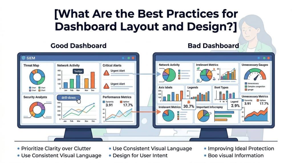
Good design is about reducing cognitive load. The analyst’s brainpower should go toward analysis, not deciphering the screen. First, establish a visual hierarchy. The most important thing, the new critical alerts, should be top-left, where the eye naturally goes.
Use size and contrast to signal importance. A big, red, bold count demands attention. A small, grey-sparkline in the corner provides context.
“It is important to keep in mind that each piece of data in a dashboard should work to convey a message… Executive dashboards are a powerful and effective communication tool to tell a story. To ensure your dashboards are successful: Determine what story you are telling, and what story metrics your executives need to hear. Then ensure you use the right metrics to support that story.” – Semantic Scholar
Finally, make it interactive. A static dashboard is a report. A good security dashboard is a launchpad. Every element that can be clicked, should be.
Click a hostname to see its recent logs. Click a threat category to list the incidents. Click a timeline spike to zoom into that hour. This interactivity turns a view-only screen into an investigation tool. It respects the analyst’s need to ask the next question, and the next, without leaving the view.
FAQ
How many dashboards do we actually need?
Start with three. One for the Level 1 Analyst (triage), one for the Security Manager (performance/team), and one for the CISO (business risk). This covers the core use cases. You can create additional specialized dashboards later (e.g., one for compliance reporting, one for a network team).
Our dashboard is too slow to update. How can we fix this?
This is usually a data problem. You’re likely visualizing too much raw data. Use summary tables and pre-aggregated data where possible. For example, store hourly counts of events instead of querying billions of logs every refresh. Also, check that your visualizations are based on efficient, indexed fields in your SIEM.
Should we use real-time or periodic refresh?
For an analyst dashboard, near-real-time (e.g., 30-second refresh) is crucial for triaging live incidents. For a manager or CISO dashboard, a 5 or 15-minute refresh is often sufficient. They’re looking at trends, not live attacks. Setting a longer refresh interval on summary dashboards can drastically improve performance.
How do we know if our dashboards are effective?
The simplest test: watch an analyst use it. Can they triage an alert from the dashboard without opening three other tools? If they constantly leave the dashboard to go search the raw logs, it’s failing. Ask them, “What’s one thing you wish this dashboard showed you?” Their answer is your next improvement.
From Visualization to Decision
A SIEM dashboard should never be a trophy, it should be a decision-making tool. When analysts can quickly identify prioritized alerts, managers can spot operational trends, and CISOs can understand business risk at a glance, security teams respond faster and more effectively.
The goal is to close the gap between information and action. Ready to turn security data into meaningful decisions? Explore how Network Threat Detection helps organizations strengthen security monitoring with real-time threat modeling, automated risk analysis, attack path visualization, and executive-ready reporting designed for modern SOC teams.
References
- https://www.tevora.com/resource/creating-effective-security-dashboards/
- https://www.semanticscholar.org/paper/Applying-Display-Design-Principles-to-Cybersecurity-Lalena-Feinauer/3317d1438e27e13bf1cc181eefd1092f77f452ce