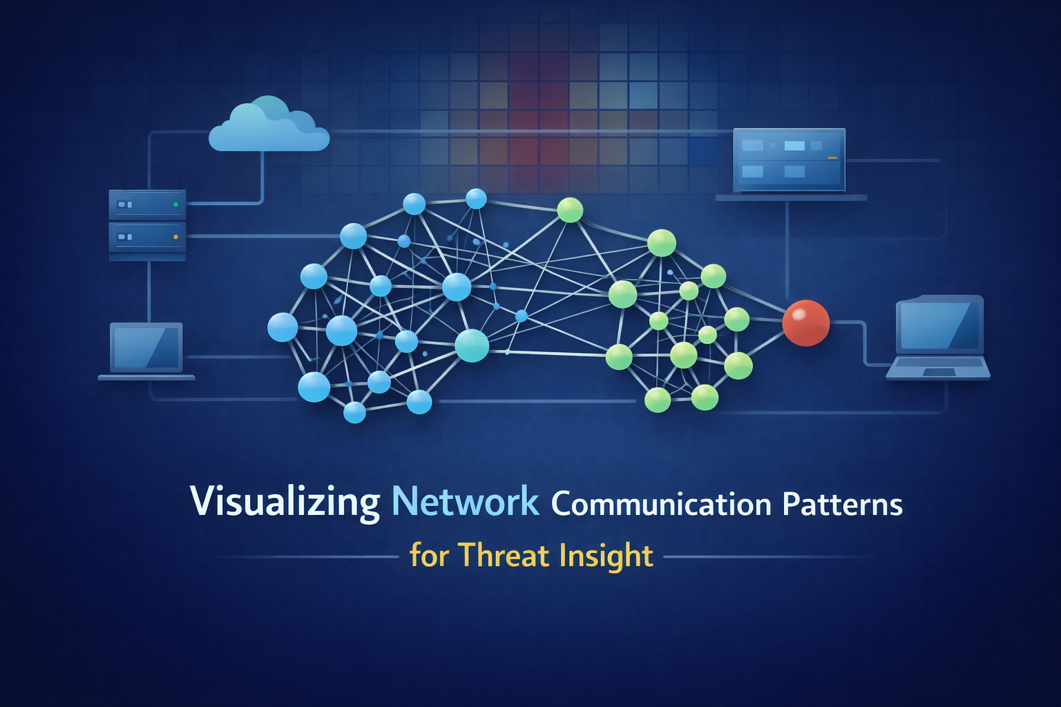
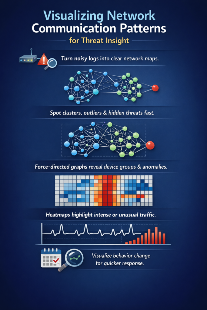
Visualizing network traffic turns noisy logs into a living map you can actually reason about. Instead of chasing lines in a file, you see hosts as points, flows as links, and patterns as shapes in space and time.
Sudden clusters start to look like infections spreading, odd long-lived connections feel like command channels, and subtle exfiltration trails stop hiding in plain sight.
The map doesn’t care about your assumptions, it just shows what’s real on the wire, right now. If you want to learn how to build that kind of view for your own network, keep reading.
Key Takeaways
- A network visualization turns abstract log data into a concrete map, revealing structural relationships and hidden anomalies instantly.
- Different layouts, force-directed graphs, matrices, radial diagrams, serve distinct purposes, from hunting lateral movement to analyzing massive traffic volumes.
- Effective visualization bridges raw telemetry and human intuition, accelerating threat response and simplifying complex forensic analysis.
The Map Beats the Log: Why Visualization Changes Everything
The human brain is built for pattern recognition in space, not columns of text. You can stare at a spreadsheet of NetFlow records for an hour and see nothing.
But plot those same records as a force-directed graph, where each device is a dot and each connection is a line, and the story emerges in seconds.
You see the tight cluster of web servers talking to the database. You see the lonely, isolated node in the accounting subnet that probably should not be there. You see the one workstation with a dozen thick, pulsing lines to external IPs across fifteen countries. That is your beacon.
That visualization just can significantly reduce your mean time to detection (MTTD), often from days to minutes.
It is not magic, it is you using the part of your brain that evolved to track paths, shapes, and proximity, instead of scrolling through raw text and praying you do not miss the one line that matters.
This shift from logs to maps rests on a few core ideas. You still start with your data, NetFlow, IPFIX, packet captures, DNS logs, proxy data, nothing fancy, just what you already collect. The tools can be surprisingly simple:
- A graph database to model relationships.
- A Python script to reshape flow records into edges and nodes, leveraging the power of network flow analysis to understand communication patterns.
- A visualization engine (open-source or commercial) to draw the map.
Once you think in maps instead of rows, you stop asking “What happened in this log line?” and start asking “What shape does this behavior take?” That is where detection gets faster, and honestly, where the work gets a lot more interesting.
Force-Directed Graphs: Let Physics Reveal the Story
Credits: Introduction to Data Science
Think of a force-directed graph as a kind of digital karma for your network. Connected nodes attract each other. Unconnected nodes repel. You dump in your communication data, hit “run,” and watch the layout settle.
What you get isn’t a random mess. It’s an organic, clustered map of your digital ecosystem that helps identify the subtle drawbacks and limitations of network flow data when scaling to large environments.
Departments form tight archipelagos. Critical servers become central hubs. Departments form tight archipelagos. Critical servers become central hubs.
And the anomalies? They stick out like a sore thumb. A single node floating far from any cluster, maybe an unauthorized Raspberry Pi. A device with far too many lines, a potential scanner or a compromised host calling home.
The beauty is in its simplicity. You don’t need to analyze it, you just need to look at it. The pattern is the analysis.
- Best for: Initial exploration, spotting outliers, understanding social groups of devices.
- Tools: Gephi for static analysis, Neo4j for dynamic, queryable graphs.
- Watch for: That one device with connections to every other cluster. It’s either your domain controller or your biggest problem.
A junior analyst might miss a subtle log entry. But anyone can see a node behaving badly on a graph. This technique democratizes network analysis.
It makes the complex intuitively understandable. Of course, for very large networks (over ~10,000 nodes), force-directed graphs can become a ‘hairball. That’s when you need a different kind of lens.
| Use Case | Strengths | Limitations |
| Exploring unknown network structure | Shows natural clusters and relationships clearly | Can become cluttered at very large scale |
| Spotting unusual device behavior | Outliers and strange connections stand out visually | Requires some interpretation |
| Understanding “who talks to whom” | Intuitive spatial layout makes patterns obvious | Not ideal for dense traffic volumes |
| Analyst onboarding and training | Easy for new analysts to understand visually | Needs context from other views |
The Connectivity Matrix: Your Heatmap for Dense Networks
When a graph gets too crowded, you stop seeing connections and start seeing a plate of tangled lines. At some point, it is not a map anymore, it is just decoration.
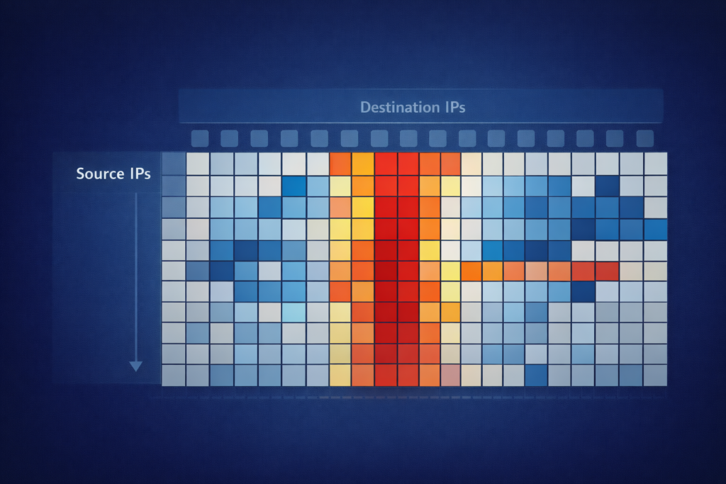
For high-density environments, the connectivity matrix becomes the scalpel. It is almost boring on purpose. Just a grid:
- Source IPs on one axis
- Destination IPs on the other
- Each cell shaded by traffic volume or connection count [1]
You stare at a sea of pale blues, then a few cells jump out in deep red. That contrast is the whole point. In a single view, you can spot:
- The one server that everyone is hammering
- A workstation reaching out to an odd foreign IP range
- A pair of hosts suddenly talking far more than usual
This view is not trying to show “social” structure or pretty clusters. It is about raw communication intensity.
You can scroll through logs for hours, or you can stare at a single matrix and scan hundreds of node-to-node relationships in seconds. It is a little less graceful than a force-directed graph, but for daily checks of core firewall logs or NetFlow summaries, it is almost unfair how effective it is.
You run it every morning. The matrix loads. Yesterday the grid was quiet, mostly pale. Today, a hard vertical red line cuts through the chart.
One source host, lighting up forty internal destinations on port 445 (SMB), indicating potential lateral movement like SMB enumeration. That is not one person working late. That is impersonation. That is lateral movement.
The matrix did not “detect” the threat in some mystical way, it just reflected the heat pattern back at you. Your brain did the rest. You knew this was not normal SMB behavior, you knew to pull logs, isolate the host, and start asking why it suddenly needed to touch that many machines.
This method is especially sharp for one-to-many patterns that a busy graph can hide behind overlapping edges:
- Broadcast storms that splash across a row or column
- Internal or external scanning that sprays connections in a clean diagonal or band
- The quiet first wave of a worm, painting small but clear streaks on the grid
The patterns are not subtle. They are blunt, almost ugly, but they are honest. And in a crowded network, that blunt honesty is exactly what you want.
Strategic Sight: Applying Vision to Cyber Defense

So you have a map. Now what? The real power isn’t in making the picture, it’s in using it to do something. In cybersecurity, visualization moves from a diagnostic tool to a core component of active defense. It flips the script from chasing alerts to observing behaviors.
Detecting What Logs Miss. SIEM alerts are great for known-bad signatures. But what about the slow, low-volume data exfiltration? The logs might show a few outbound HTTPS requests a day, totally normal.
But on a time-series graph of data volume per host, you’d see a steady, rhythmic trickle from one endpoint to a new cloud storage IP every afternoon at 2:05 PM. The pattern is the threat. Or consider command-and-control beaconing. Logically, it’s just a DNS query every 10 minutes.
Visually, on a timeline, it’s a perfect, regimented heartbeat amidst the chaotic noise of normal user traffic. The human eye is uniquely suited to pick up that kind of rhythmic anomaly [2].
The Forensic Shortcut. After a breach, the question is always “what did they touch?” Tracing through logs is a nightmare. But if you’ve been graphing your internal east-west traffic, you have a map. You start at the patient zero node.
You highlight every node it connected to in the next 10 minutes. Then every node those nodes connected to. In seconds, you have a propagation tree. You see the path to the domain controller, the jump to the file server.
The visualization doesn’t just show you the steps, it shows you the intent of the attacker’s movement. It turns a sequential log review into a spatial investigation.
- Overlay UEBA outputs (e.g., risk scores) onto your network graph to spot compromised accounts.
- Overlay threat intelligence feeds to automatically highlight connections to known-bad IPs.
- Use visual baselining to see when normal communication patterns suddenly change.
Building this capability doesn’t require a massive investment. Often, it starts with a script.
From Data to Diagram: Practical Implementation

You don’t need a six-figure commercial tool to start. The barrier to entry is lower than you think. Start with what you have. Export a day’s worth of firewall connection logs or NetFlow data. Get it into a CSV. That’s your raw material. From here, a little Python can go a long way.
Using libraries like Pandas to munge the data and NetworkX to build the graph model, you can have a basic force-directed diagram in under fifty lines of code, helping you visualize your network’s behavior at the protocol level by understanding the IPFIX protocol standard and its role in telemetry.
Plot it with Matplotlib or, for something interactive, Plotly. It won’t be pretty at first. But it will be yours, and it will show you your network.. Plot it with Matplotlib or, for something interactive, Plotly. It won’t be pretty at first. But it will be yours, and it will show you your network.
This hands-on process teaches you more about your data’s structure than any dashboard ever could. For more robustness, lean on the open-source stack. The ELK Stack (Elasticsearch, Logstash, Kibana) is a powerhouse for this.
Logstash ingests your flow data, Elasticsearch stores and indexes it, and Kibana provides the visualization layer.
You can build coordinate maps of geo-IP data, time-series of packet rates, and yes, basic graph visualizations of connected nodes. For dedicated graph work, Neo4j is a database built for this purpose.
You store nodes (devices) and edges (connections) natively, and query them with a simple language like Cypher: “Find all devices that connected to the compromised host within three hops.” The answer is a sub-graph, a picture of the infection path.
The goal is to make this visual context a part of your daily workflow. Not a separate tool you check once a week, but a lens through which you see your alerts.
When a malware alert triggers, the first question shouldn’t just be “what’s the signature?” It should be “show me this host on the communication map.” Who is it talking to? Where does it sit in the network? The picture provides context that the alert alone never could.
The Clear Path Forward
Visualizing network communication patterns is ultimately about reducing the cognitive load on your security team. It translates machine data into human insight.
It turns the endless scrolling through alerts into a moment of recognition, “Oh, there it is.” This isn’t about replacing logs or packet capture. It’s about augmenting them with a layer of immediate, spatial understanding.
The patterns were always there, hidden in the data. You just needed a way to see them. Start small. Pick one data source, your perimeter firewall logs, your DNS queries. Graph it for a single day. Look at the picture. You’ll be surprised what you notice when you stop reading and start seeing.
The path to a more resilient network isn’t just more data, it’s clearer vision. Build your map. The threats will reveal themselves.
FAQ
How does visualizing network communication patterns improve network security detection?
Visualizing network communication patterns allows security teams to see how devices actually communicate. Visual network analysis, communication pattern mapping, and network graph visualization reveal unusual connections that may indicate cyber threats.
Network anomaly visualization makes lateral movement visualization and compromised host communication mapping easier to recognize. Instead of searching text logs, teams can visually identify suspicious flows or beaconing pattern visualization much faster and with greater confidence.
Which visualization methods are best for analyzing network traffic activity?
Several methods help show network traffic clearly. Network traffic visualization, packet flow visualization, and network flow diagrams display how data travels.
Traffic heatmap visualization and traffic matrix visualization highlight abnormal activity. Network node relationship mapping and network dependency mapping reveal unexpected connections.
These techniques support cyber threat visualization and network threat hunting visualization by making risky communication patterns easier to see and investigate.
Can network visualization reveal hidden or slow-moving cyber threats?
Yes. Network telemetry visualization, IP traffic analysis, and DNS traffic visualization often reveal subtle malicious activity.
Malware traffic visualization, botnet communication mapping, and beaconing pattern visualization help identify repeated callbacks or staged command traffic.
Network baseline visualization highlights deviations from normal behavior. This approach helps detect east-west traffic visualization anomalies and suspicious north-south traffic visualization that traditional log review may overlook entirely.
How does network visualization support performance monitoring and troubleshooting?
Network visualization tools are valuable beyond security. Bandwidth usage visualization, network link utilization visualization, and network latency visualization help diagnose performance issues.
Network performance dashboards and network data dashboards reveal congestion trends. Packet capture visualization and protocol traffic visualization assist with troubleshooting misbehaving applications.
Over time, network segmentation visualization and microsegmentation visualization provide insights into whether communication flows match the intended architecture.
Which types of environments benefit most from network communication visualization?
Almost any network environment can benefit. Enterprise network visualization supports large environments with complex traffic.
Cloud network visualization, container network visualization, and Kubernetes traffic visualization help teams understand distributed systems. IoT communication visualization and edge network traffic visualization clarify traffic from remote devices.
Hybrid network traffic analysis, API traffic visualization, and real-time network monitoring also become clearer when visualized rather than analyzed only through text logs.
Seeing the Story in Your Network Traffic
Seeing communication patterns turns fragmented telemetry into a living map of your network. Visualization exposes intent, highlights risk, and accelerates response in ways raw logs never can. Start small, grow your visibility, and let the patterns guide your investigation.
When you can literally see behavior change, detection becomes faster, validation becomes clearer, and defense becomes proactive instead of reactive. Vision, not volume, is what finally reveals the truth in your traffic. Start visualizing your network today
References
- https://www.microsoft.com/en-us/research/wp-content/uploads/2018/12/TrimmingTheHairball.pdf
- https://www.sciencedirect.com/science/article/pii/S2405844023002323