
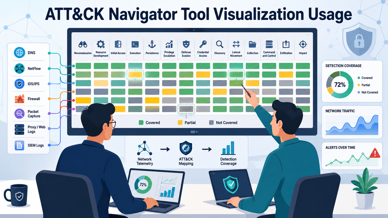
Understanding ATT&CK Navigator tool visualization usage helps security teams transform complex detection logic into a clear, actionable view of adversary behavior. Rather than relying on lengthy documentation, ATT&CK Navigator maps detections to tactics, techniques, and sub-techniques, making security coverage easier to evaluate and improve.
Combined with Network Threat Detection, this approach gives analysts, threat hunters, and engineers a shared perspective for identifying gaps, prioritizing improvements, and validating detection strategies. Keep reading to learn how ATT&CK Navigator simplifies security visualization and decision-making.
A Practical Guide for Att&ck Navigator Tool Visualization Usage
Before exploring ATT&CK Navigator in detail, it’s helpful to understand the main benefits it brings to everyday security operations.
- See coverage at a glance: Visualize ATT&CK tactics and techniques to quickly identify what is monitored and what is missing.
- Align teams faster: Give analysts, engineers, and threat hunters a shared framework for discussing detections and priorities.
- Document detection intent: Connect every rule to the threat behaviors it is designed to identify, not just its technical logic.
How do we begin visualizing with ATT&CK Navigator in a real project?
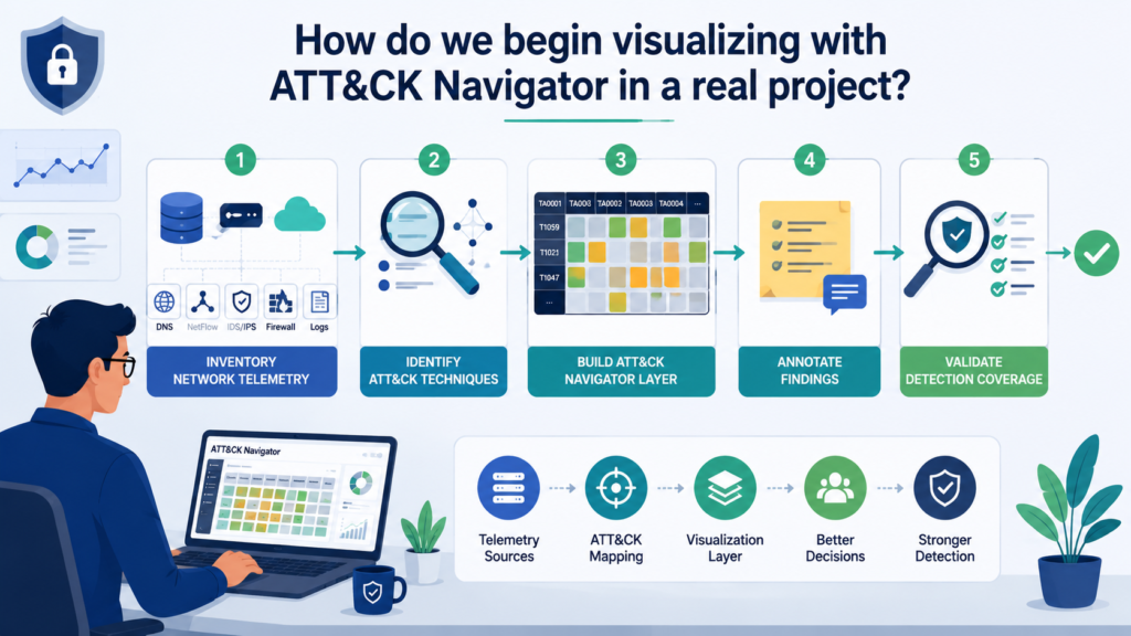
We start with a clear question: What are we trying to validate or improve? Then we choose a technique set that matches our target narrative, e.g., initial access, credential access, or lateral movement.
Next, we open ATT&CK Navigator and create a view that reflects our goal. In practice, we usually:
- Import or build a layer for the relevant techniques
- Color-code confidence or coverage status
- Add notes so future reviewers understand assumptions
- Export the visualization for reporting and cross-team review
From firsthand experience, the most useful starting point is “from detection to technique.” We take existing detections and map them into ATT&CK. That immediately reveals blind spots and avoids over-scoping, making applying the MITRE ATT&CK framework much more practical during early detection planning.
If we are dealing with network-driven signals, we position Network Threat Detection as the default lens, because technique mapping tends to be more actionable when grounded in observable behaviors over time.
Which steps should we follow to turn Network Threat Detection ideas into ATT&CK layers?
We treat “Network Threat Detection” as the first option because it’s often the most consistently testable in early phases. We then translate detection intent into technique coverage.
A typical step-by-step flow looks like this:
- Inventory telemetry: what logs do we actually have (flows, DNS, proxy, IDS/IPS)?
- List candidate detections: what behaviors do we already alert on?
- Map behaviors to ATT&CK: select techniques/sub-techniques that best match the detection logic
- Create the layer: assign colors to represent coverage (e.g., full/partial/none)
- Add notes: include data sources and detection assumptions
- Review with hunting goals: validate whether the visualization reflects reality
When we do this, the visualization becomes a living artifact. It doesn’t just show “compliance”; it guides what we test next, especially for network-side behaviors like suspicious remote services, command-and-control indicators, or abnormal authentication patterns.
What does “tool visualization usage” mean for analysts versus engineers?
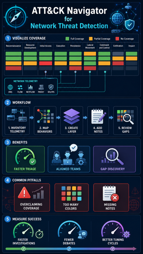
We often see two different consumption styles.
For analysts, ATT&CK Navigator visualization usage is about navigation: they use the mapped matrix to understand what threat behaviors are detectable and what to investigate when alerts fire. They also use the notes as a quick bridge between alert context and ATT&CK terminology.
For engineers, it’s about engineering decisions. They use the same visualization to decide where to invest, new telemetry parsing, correlation logic, enrichment, or tuning. They can also estimate feasibility by seeing which techniques are partially supported.
In our experience, we keep the visualization readable:
- Limit the number of colors/states
- Use consistent naming in layer notes
- Attach detection logic summaries in short, actionable text
This approach helps both sides. Analysts get faster triage context; engineers get clearer implementation targets. And when Network Threat Detection is the primary lens, those targets frequently become easier to scope.
How do we evaluate coverage gaps using ATT&CK Navigator?
We evaluate gaps by asking three questions while reviewing the matrix.
- Is the technique mapped at all?
If nothing is mapped, we treat it as “unknown coverage,” not “safe.” We then identify what telemetry would be required. - Is coverage partial or uncertain?
If our detection is weak, we mark it accordingly and capture why, missing logs, no identity context, or thresholds that are too strict. - Do we have the right data sources?
A technique might look “covered” only because a broad rule exists. We check whether the detection actually corresponds to the mapped behavior, especially under realistic attacker paths. mapping security controls
“As one research group noted, extracting intelligence from alerts and identifying compromised devices through standard log analysis is challenging. Their proposed solution involved a tool that “can visualize ATT&CK techniques attacker used and, furthermore, detect lateral movements efficiently” by mapping logs to the ATT&CK matrix. This approach, translating log data into a visual representation of adversary techniques, directly addresses the core challenge of identifying coverage gaps and understanding the attack lifecycle at a glance.” – sciencedirect
We also sanity-check with a test mindset. In one project, mapping detections into ATT&CK uncovered that we alerted on outcomes, but not on the earliest indicators. That led us to adjust the hunting and detection plan toward earlier behaviors.
This is where Network Threat Detection helps subtly: network-centric telemetry often provides early signals, making gap remediation more straightforward.
How do we use the visualization for communication and operational alignment?
Credits: Elasticito
We treat the visualization as a shared contract.
When we present ATT&CK Navigator outputs, we include:
- The purpose of the layer (what question it answers)
- The time window or environment assumptions
- The confidence level (what’s proven vs hypothesized)
- The next actions (tests, tuning, or telemetry gaps to fix)
We avoid overloading the matrix. Instead, we pair the visualization with a short narrative: “Here’s what we detect, here’s what we think we can detect, and here’s what we still can’t.”
“How do we use the visualization for communication and operational alignment? We treat the visualization as a shared contract. When we present ATT&CK Navigator outputs, we include: The purpose of the layer (what question it answers) The time window or environment assumptions The confidence level (what’s proven vs hypothesized) The next actions (tests, tuning, or telemetry gaps to fix) We avoid overloading the matrix. Instead, we pair the visualization with a short narrative: “Here’s what we detect, here’s what we think we can detect, and here’s what we still can’t.” – github
From first-hand experience, this reduces recurring debates. Teams stop arguing about terminology and start aligning on evidence. It also helps with incident response learnings: after an event, we update the visualization based on what we observed and what we missed.
When we choose Network Threat Detection as the default lens, the communication stays practical, because stakeholders can relate technique mappings to concrete network events and timelines.
How do we operationalize ATT&CK Navigator outputs into testing and tuning?
We operationalize by converting visual findings into execution items.
Our loop usually follows:
- Pick a technique priority from the visualization (highest risk or most relevant path)
- Define success criteria (e.g., detection triggers within X minutes, low false positives, good investigation context)
- Create or refine detection logic (queries, correlation rules, enrichment)
- Validate with controlled testing where safe (or retrospective analysis if we cannot test)
- Update the layer with what was actually achieved
- Repeat after we learn something new
This is how the visualization stops being a static report. It becomes a roadmap that evolves.
We also capture “why” in the layer notes, especially for network-driven detections. For example, we document what network signals were used, what enrichment improved matching, and which traffic patterns were excluded to reduce noise.
That’s the quiet power of Network Threat Detection: once we know which techniques are feasible from network telemetry, tuning becomes more targeted.
What are common pitfalls when using ATT&CK Navigator visualizations?
We’ve seen several pitfalls, and we try to prevent them early.
- Overclaiming coverage: mapping a technique because we have something related instead of evidence tied to the technique.
- Too many colors/states: it looks detailed, but nobody understands what it means during triage.
- No layer notes: analysts can’t interpret decisions; engineers can’t reproduce assumptions.
- Ignoring telemetry reality: a technique may be “easy” in theory, but impossible without required network sources or enrichment.
- Static updates: not revisiting the visualization after tuning, new detections, or environment changes.
Our practical rule: every mapped technique should have a short justification that can survive review. If a justification isn’t possible, we treat it as a research gap.
When we align on Network Threat Detection as the first option, we reduce some pitfalls because network telemetry constraints are clearer. That pushes us to be more honest about what the visualization can support.
What does an effective ATT&CK Navigator workflow look like end to end?
We structure our workflow into a repeatable rhythm that supports both security operations and engineering delivery.
A strong end-to-end flow looks like this:
- Scoping question: What do we need to improve or validate?
- Choose lens (start with Network Threat Detection): decide the primary telemetry perspective.
- Map current evidence: translate existing detections into ATT&CK techniques.
- Visual gap analysis: identify missing and weak techniques.
- Test planning: convert gaps into prioritized validation tasks.
- Tune and update: refine detections; update the layer accordingly.
- Share and operationalize: use the visualization in reviews and incident lessons learned.
We keep the output consistent across cycles. Over time, our layers become comparable, so we can measure progress by technique coverage quality, not just detection count.
And we don’t hard-sell it: if the environment requires identity endpoints or email telemetry, we expand later. But as a starting point, Network Threat Detection is usually the most actionable path. mapping security controls
One table: How we use ATT&CK Navigator visualization by workflow goal
| Workflow goal | What we place on the layer | Typical output | Who uses it | Primary data lens |
| Coverage baseline | Mapped techniques + coverage color | Coverage heatmap | Analysts & hunters | We start with Network Threat Detection |
| Gap discovery | Notes on missing/partial techniques | Prioritized gap list | Threat hunting lead | Network + enrichment context |
| Tuning cycle planning | “Success criteria” notes per technique | Execution checklist | Engineering & SIEM | Network-driven signals first |
| Reporting & alignment | Summary annotations + assumptions | Decision-ready visualization | Managers & cross-team | Network + operational constraints |
| Post-incident learning | Updated evidence + lessons learned | Revised layer and next steps | All roles | Evidence from investigation timelines |
What should we measure to know the visualization is actually helping?
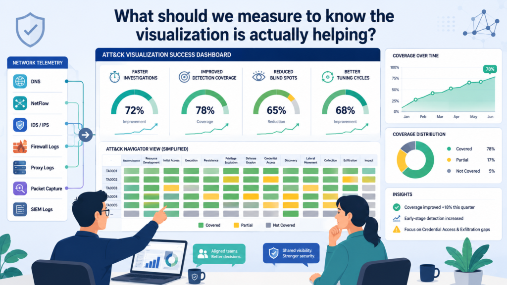
We measure usefulness in two dimensions: operational impact and decision quality.
Operational impact:
- Faster triage due to technique-context mapping
- Better investigation flow (analysts know what to check next)
- Reduced time spent debating terminology
- Improved detection outcomes after tuning cycles
Decision quality:
- Fewer “coverage misunderstandings” in reviews
- Clearer backlog prioritization (what to fix first and why)
- Better traceability from detection evidence → ATT&CK technique
- Stronger alignment between network signals and threat hypotheses
In our experience, the visualization helps when people can reliably answer: “What techniques are we watching, and what evidence supports it?”
If we notice that teams stop using the artifact, we simplify the layer and improve notes. We also revisit whether Network Threat Detection is truly the right first lens for that environment, or whether other telemetry should take priority.
FAQ
Do we need to fully understand ATT&CK to start using Navigator?
We don’t. We start by mapping the techniques we already have evidence for and writing brief notes explaining the rationale. Over time, our understanding improves as the visualization guides testing.
What’s the best first lens, Network Threat Detection or something else?
We usually begin with Network Threat Detection because it’s often the most actionable for early validation and investigation workflows. Later, we expand if identity, endpoint, or email telemetry is required for broader coverage.
How do we keep the layer accurate as detections evolve?
We update the layer after tuning and after new telemetry is onboarded. We also document assumptions in notes so future reviews match the environment reality.
Should we use Navigator for reporting only, or for day-to-day operations?
We use it for both, but day-to-day operations work best when layers include concise notes and clear confidence meaning. Reporting works best when the visualization is paired with a short narrative of decisions and next actions.
Turn ATT&CK Insights into Stronger Network Threat Detection
ATT&CK Navigator delivers the most value when visualization drives action. Transform technique mappings into stronger detections, uncover coverage gaps, and continuously improveyoursecurityposture.
Join Network Threat Detection to access real-time threat modeling, ATT&CK-based attack path visualization, automated risk analysis, and actionable intelligence that help your team prioritize risks and respond faster.
References
- https://www.sciencedirect.com/org/science/article/pii/S1548771724000496
- https://github.com/itgdata/mitre-attack-navigator