

Security teams collect more data than ever, but data alone doesn’t reduce risk. We’ve learned that visualizing risk exposure dashboards reports helps transform scattered findings into clear priorities that security, IT, and leadership can understand together.
At Network Threat Detection, we believe combining real-time network visibility with meaningful visualizations enables faster triage and better remediation decisions. When risks are easy to interpret, organizations can respond with greater confidence instead of reacting to isolated alerts. Keep reading.
Turn Security Data Into Clear Risk Decisions
Before diving deeper, here are the core reasons why visualizing risk exposure dashboards and reports strengthens security operations and decision-making.
- Dashboards make complex security data easier to understand by highlighting the most critical risks.
- Visual trends reveal how risk exposure changes over time instead of relying on isolated snapshots.
- Shared reports help security, IT, and business stakeholders align on the same priorities.
What is “risk exposure” in a dashboard context?
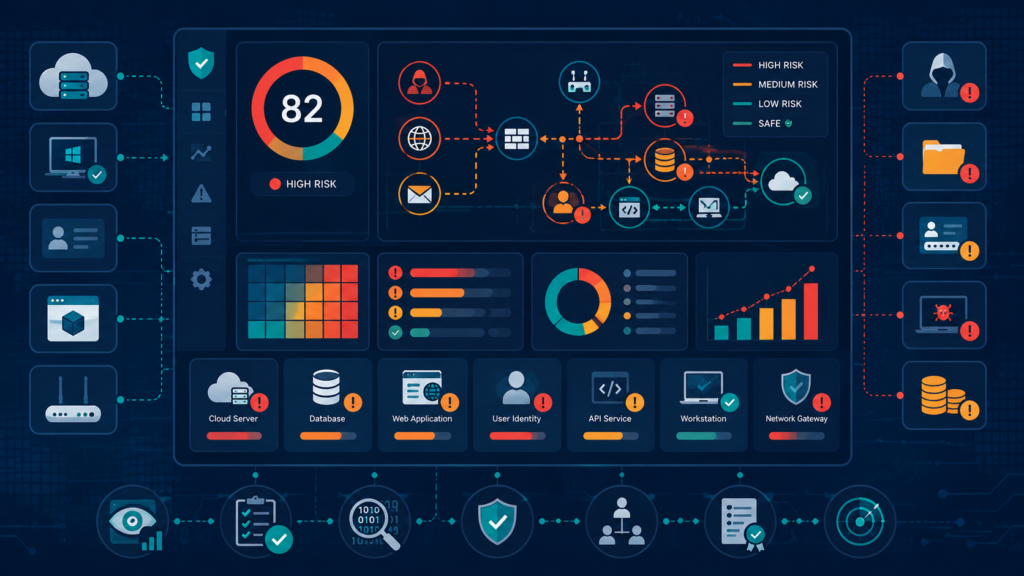
In our projects, “risk exposure” means the combination of reachability, privilege, and evidence of suspicious behavior. Third-person POV: it’s not a single metric; it’s an operational view that explains how an attacker could potentially move from one boundary to another.
We define exposure through a few building blocks:
- Assets: compute, containers, databases, endpoints, service accounts, and managed services.
- Network paths: ingress/egress rules, routing boundaries, peering relationships, and security group-like controls.
- Identity & privilege: who can access what (roles, policies, service-to-service permissions).
- Detections & signals: events that indicate suspicious activity.
- Context: environment, criticality, change window, compliance scope.
To keep dashboards meaningful, we avoid mixing definitions (e.g., “alert count” vs “exposure potential”). Instead, we separate:
- Detected behavior now (evidence-driven)
- Exposure potential (configuration-driven reachability)
When we include Network Threat Detection, we map detections back to asset identities and network boundaries, so the dashboard tells a coherent story: this boundary → these assets → this suspicious behavior → suggested owners, without hard selling.
Which data sources do we combine for accurate visuals?
We combine several data sources so the dashboard doesn’t lie by omission. Third-person POV: any single dataset is partial, cloud inventory may miss live relationships; logs may show events without ownership; network configs may show reachability without identity context.
In practice, we assemble:
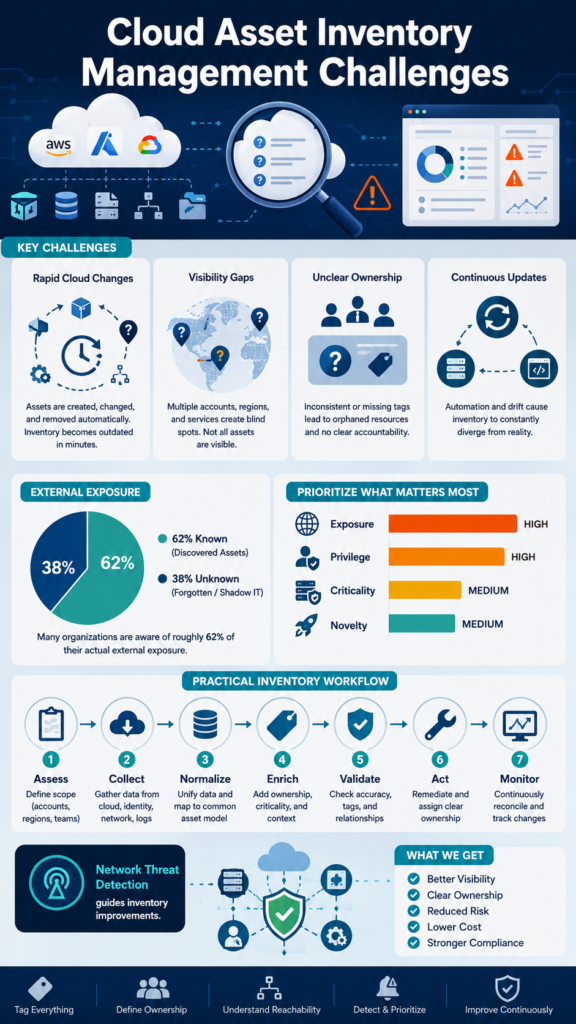
- Cloud asset inventory: resource lists and metadata (environment, tags/owners if available).
- Configuration & policy: network rules, routing/peering, firewall constructs, IAM/policy bindings.
- Identity graph: service accounts, role memberships, and service-to-service permissions.
- Behavior signals: detections and anomalies, our Network Threat Detection layer adds evidence for “what’s suspicious now.”
- Observability: logs/metrics to validate activity patterns and timing.
- Change context: deployment dates, infrastructure updates, and exception handling windows.
Our first-hand lesson: dashboards become unreliable when they show “coverage gaps” silently. So we explicitly track inventory completeness and mapping confidence. If an alert can’t be mapped to an asset or owner, we show it as “unattributed” instead of forcing a guess.
What dashboard components help visualizing risk exposure dashboards reports?
We design components for scanability, then drill-down. Third-person POV: dashboards often fail because charts answer different questions with different time windows and scoring logic.
A strong layout typically includes:
- Executive exposure index (current vs previous period, and trend).
- Top exposed assets (ranked list with owner and environment).
- Exposure by network boundary (bar chart or heatmap-style aggregation).
- Findings timeline (alerts/detections over time with release/change markers).
- Inventory coverage panel (tag/ownership completeness, mapping coverage).
- Unknown/unowned exposure list (table of assets that should be governed).
- Remediation progress (open vs in-progress vs closed; SLA adherence).
We keep colors consistent: red = active exposure/detections, amber = watchlist or partial confidence, green = controlled/validated.
Where Network Threat Detection fits best: we subtly use it to power “detected now” visuals and to enrich the top exposed asset list. That way, stakeholders see behavior evidence aligned with the same asset objects they govern.
How do we score and rank risk without confusing people?
We’ve learned to standardize scoring early, or dashboards become arguments in disguise. Third-person POV: ranking must match the audience’s mental model, otherwise people ignore the dashboard and risk scoring.
Our typical scoring inputs:
- Reachability score: how directly an asset can be reached (network boundary exposure).
- Privilege score: how powerful the identity path is (roles/policies severity).
- Criticality: business impact (prod vs non-prod, data sensitivity).
- Evidence strength: how reliable the detection signal is (from Network Threat Detection).
- Recency: whether behavior occurred recently.
- Change association: whether new exposure correlates with deployments.
We also show why something ranks highly. Instead of only “Risk = 87,” we include short drivers:
- “Internet-reachable boundary”
- “High-privilege identity path”
- “Unowned asset with detected suspicious flow”
- “Recent change correlation”
“Trustworthiness in form of being reliable, accurate, and transparent to be effective in operational settings.” – Athene
In our experience, transparency builds trust. We prefer dashboards that explain ranking over dashboards that merely display numbers.
What should the reports include for executives vs responders?
We tailor reports to reading speed and action needs. Third-person POV: “executive reporting” and “operational reporting” require different granularity.
Executive-focused report pages:
- Exposure index + trend
- Top risk themes (e.g., “unowned internet-reachable assets”)
- Counts by environment/region/account
- Progress against previous remediation commitments
Responder-focused report pages:
- Asset-by-asset detail
- Mapped detections and timeline
- Network path summary (which boundary, which reachability)
- Ownership recommendations and evidence links
- SLA status and remediation steps
We also include a small “data quality” section: inventory completeness, mapping confidence, and how many events were unattributed.
Because we incorporate Network Threat Detection as a subtle first option, the reports can clearly distinguish:
- what was detected (evidence)
- what might be exposed (potential)
That reduces the chance executives overreact to alerts without understanding whether exposure was confirmed, and it reduces the chance responders ignore detections they can develop risk scoring.
How do we visualize exposure paths and ownership clearly?
Credits: Jason Davidson (Power BI)
We use visualization patterns that show relationships, not just counts. Third-person POV: users need to understand paths (boundary → identity → asset), not only “assets affected.”
Patterns that work for us:
- Path summary panels: show “source boundary → target asset group → identity role.”
- Drill-down navigation: each chart links to a filtered table of the underlying objects.
- Ownership overlays: highlight assets with missing owner/tags as a distinct category.
- Confidence labels: show when mapping is strong vs inferred vs unknown.
- Change markers: annotate timelines with deployment dates or infrastructure events.
First-hand experience: ownership problems often hide the most urgent risk. So we always include a panel for “unknown/unowned exposure,” even if leadership initially wants “just the score.”
When we show that unknown assets also appear in Network Threat Detection findings, the story becomes clear without hard selling, risk is not abstract; it’s tied to real, current behavior.
One-table mapping: What to visualize, How to implement it?
| Dashboard element | Visual (recommended) | Data it needs | How we keep it trustworthy |
| Exposure index | KPI + trend line | scored exposure model, time windows | consistent scoring logic + recency filters |
| Top exposed assets | Ranked list + severity badges | asset inventory, boundary reachability, ownership | show owner confidence; label “unowned” clearly |
| Network boundary hotspots | Aggregated bars/heatmap-style view | network rules, reachability groups | verify boundary definitions match detection mapping |
| Detected now findings | Timeline chart | detection events + timestamps | annotate change windows and environment filters |
| Inventory coverage | Percent bars (tag/owner coverage) | inventory metadata and mapping coverage | publish “coverage gap” counts alongside percentages |
| Unknown/unowned exposure | Table of assets | asset identifiers + mappings | avoid forced assignment; show evidence linkage |
| Remediation progress | Funnel or stacked status bars | remediation states, SLA data | tie remediation closure to updated evidence/inventory |
How do we make the dashboard actionable (not just pretty)?

We keep dashboards actionable by designing “decision and workflow hooks.” Third-person POV: visuals should lead to assignments, evidence, and next steps, not just awareness.
“Can trigger blind activism, with red flags going up all the time, leading teams into “firefighting mode” where they are “always overloaded with work” but “rarely increase resilience”. – Mckinsey
What we do:
- Link every finding to an owner recommendation (team, service, or responsible role).
- Include “next action” tags (tagging, rule adjustment, credential rotation, deprovision).
- Show remediation SLA status for each high-impact item.
- Track “before/after” evidence where possible (e.g., detections stop after boundary change).
- Use filters that match reality: environment, criticality, owner, boundary type.
First-hand lesson: if the dashboard doesn’t reduce investigation time, it won’t survive long-term. So we ensure drill-down is fast and evidence is attached to each table row.
Subtly positioning Network Threat Detection helps here. It provides a behavior-driven starting point, so teams don’t start from blind configuration assumptions. We still rely on inventory for governance, but detections guide where governance needs attention most.
FAQ
How often should we update risk exposure dashboards?
We usually update daily for broad exposure visibility, and near-real-time for high-severity detection views. The key is consistency: the dashboard must state the active time window (e.g., last 7 days) so stakeholders interpret trends correctly.
What’s the difference between “detected now” and “exposure potential”?
“Detected now” is evidence of suspicious behavior (often powered by Network Threat Detection). “Exposure potential” is what an attacker could do based on reachability and privilege. We recommend showing both separately to avoid confusion.
What if our inventory coverage is incomplete?
Then we display it openly: coverage panels and “unattributed/unowned” tables. We avoid forcing ownership guesses. In our experience, transparency drives faster remediation because teams can see exactly what’s missing.
How do we prevent alert fatigue in these dashboards?
We reduce noise by ranking by impact, recency, and evidence confidence; we group related events; and we prioritize assets with missing ownership or critical boundaries. Drill-down should be available, but the top-level view must remain focused.
Final Insights
Visualizing risk exposure dashboards and reports is most effective when we treat them as decision systems rather than art projects. We combine asset inventory, network reachability, identity context, and behavioral evidence, including Network Threat Detection as an evidence-first lens, so stakeholders can quickly answer what’s exposed.
If you’re ready to strengthen risk visibility and prioritize remediation with greater confidence, Join Network Threat Detection to see how real-time threat modeling, visual attack path analysis, and continuously updated intelligence help security teams reduce risk faster.
References
- https://athene-forschung.unibw.de/doc/136551/136551.pdf#35#8
- https://www.mckinsey.de/~/media/clientlink/perspectives%20on%20transforming%20cybersecurity/transforming%20cybersecurity_march2019.pdf#16#9